Publication & Motion Design
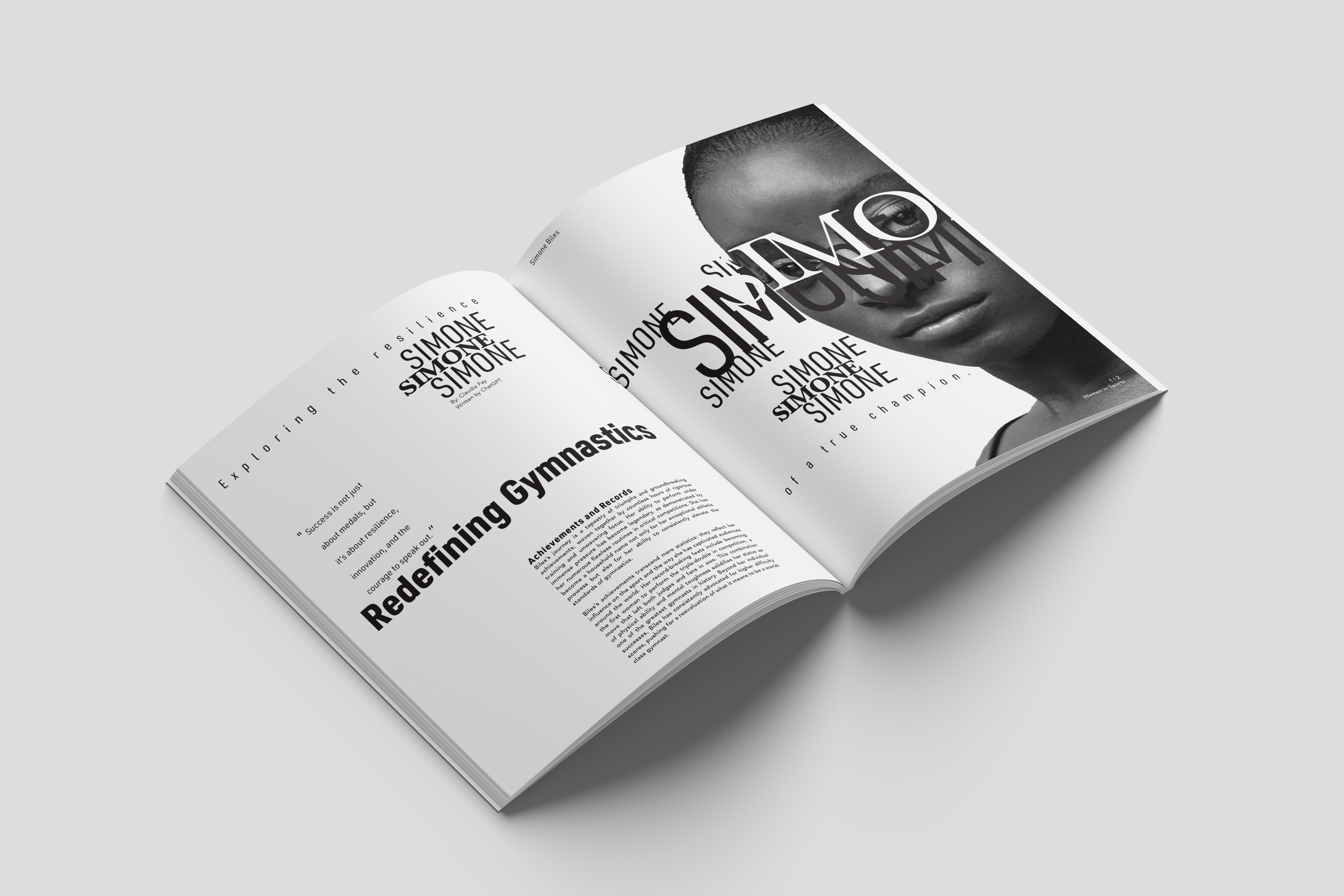
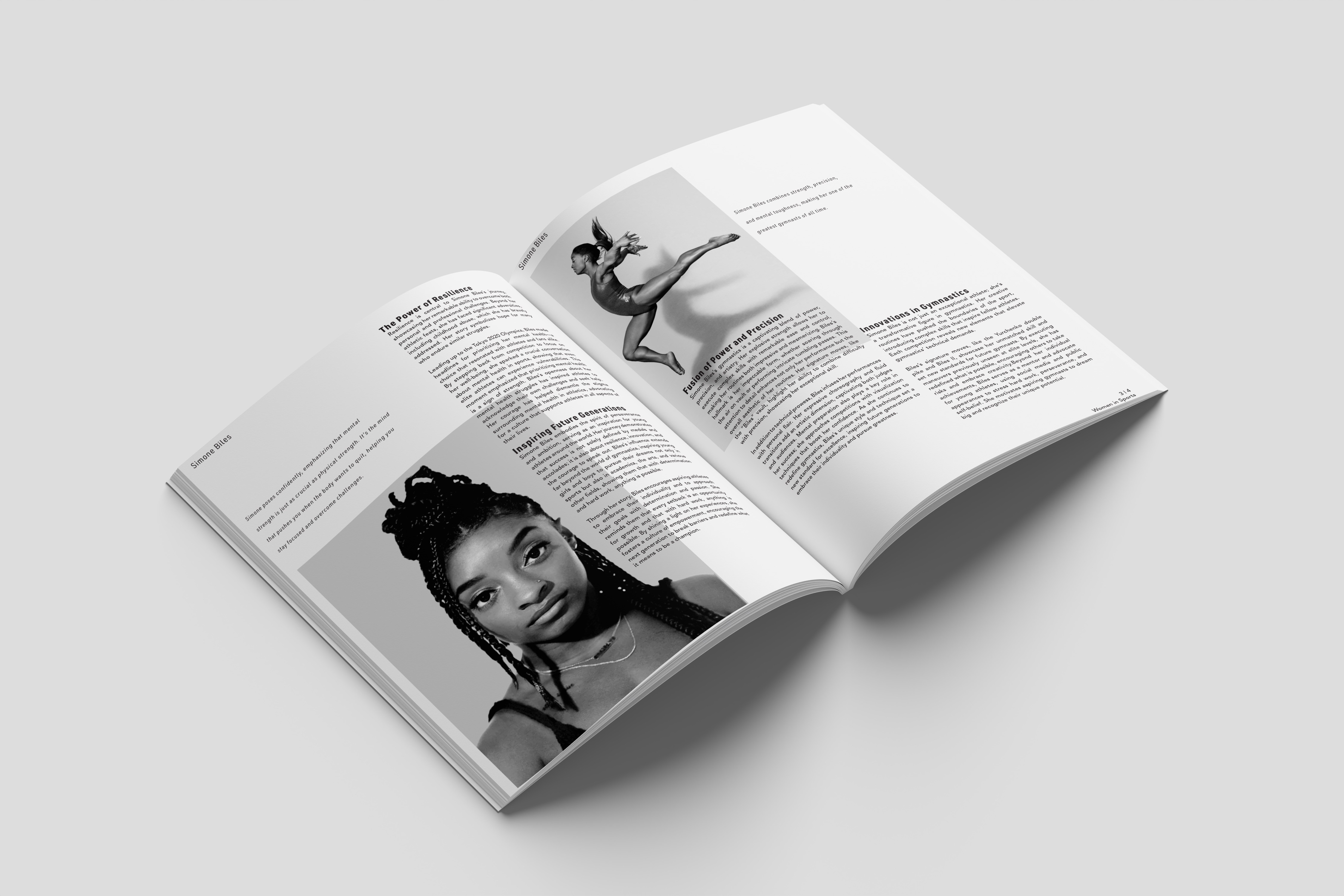
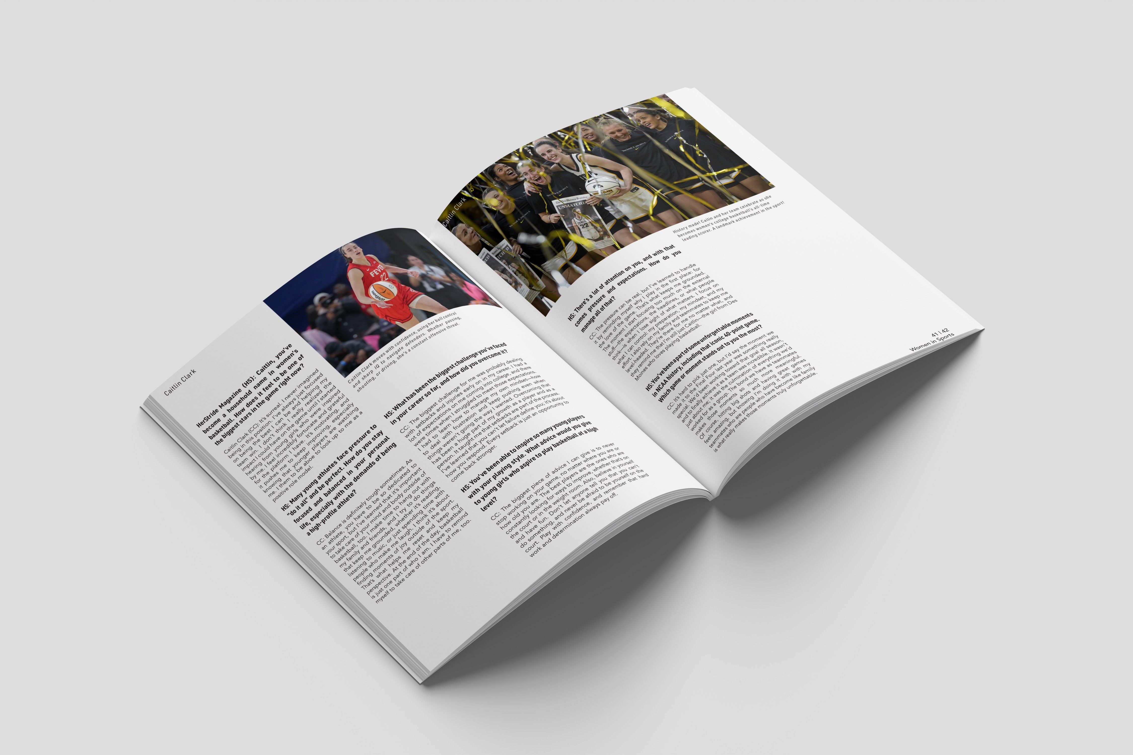
HerStride is a fictional sports publication created to celebrate women in sports through bold editorial design and compelling visual storytelling. The project focused on building a cohesive brand from the ground up, combining a strong visual identity with publication design and promotional assets to create an engaging, recognizable experience across print and digital media.

ROLE
PROBLEM
I created HerStride's brand identity from the ground up, designing the logo, typography, and visual system before applying it across editorial spreads, a magazine cover, promotional materials, and 3D mockups. The result is a cohesive brand that celebrates women in sports through bold editorial storytelling.
RESULTS
How It Started
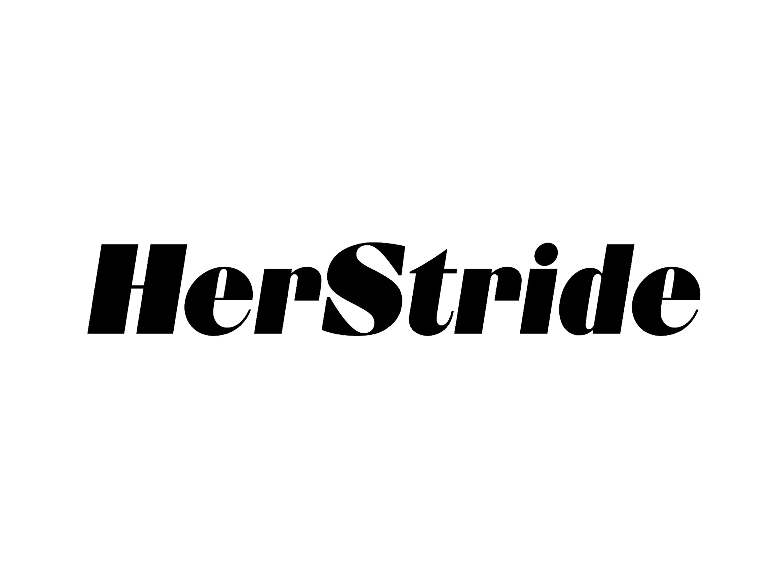
The project began by selecting a focused topic and expanding it into a complete publication. Through research, sketching, and ideation, I developed a custom logomark that embodied the strength, agility, and determination of female athletes. After refining the concept through feedback and multiple iterations, I established the brand identity and used it as the foundation for the publication's typography, layouts, and visual direction.

Process
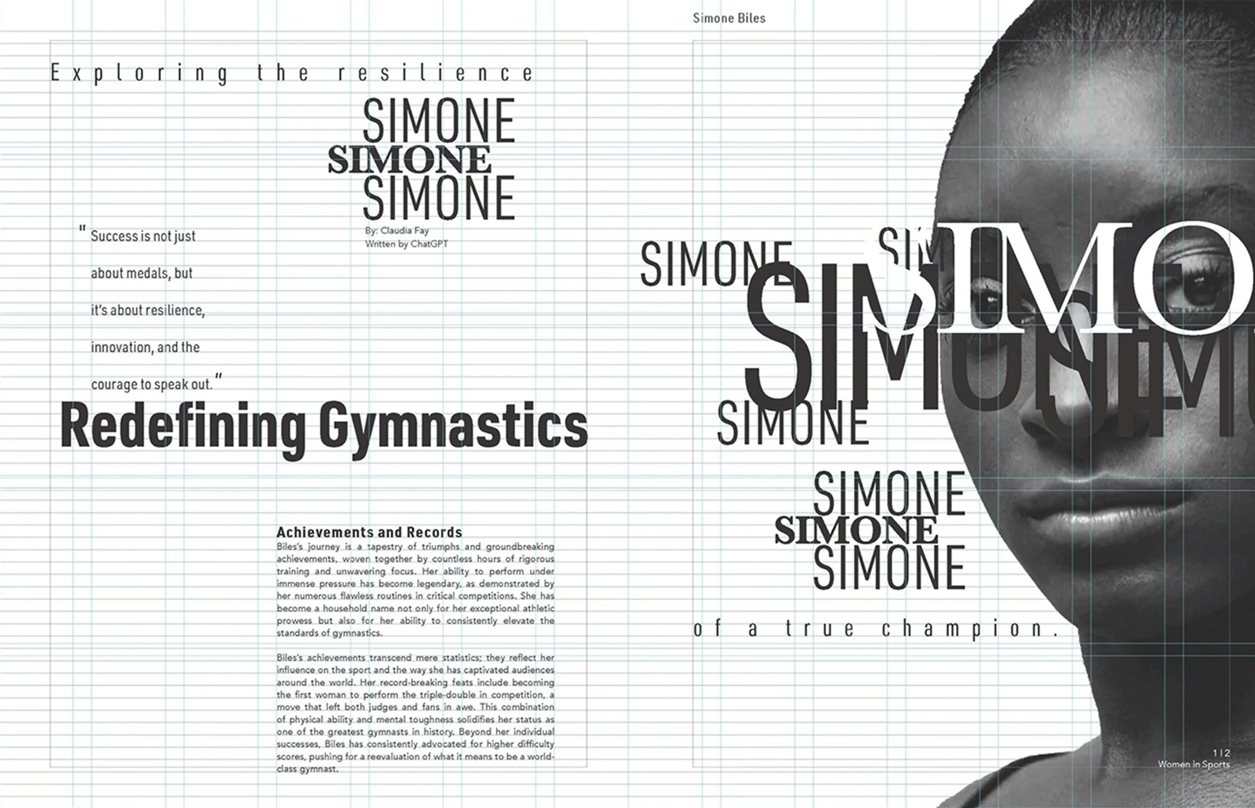
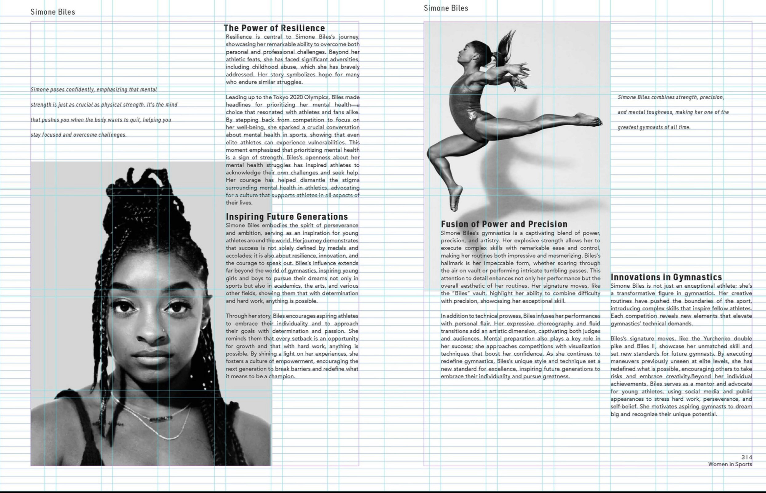
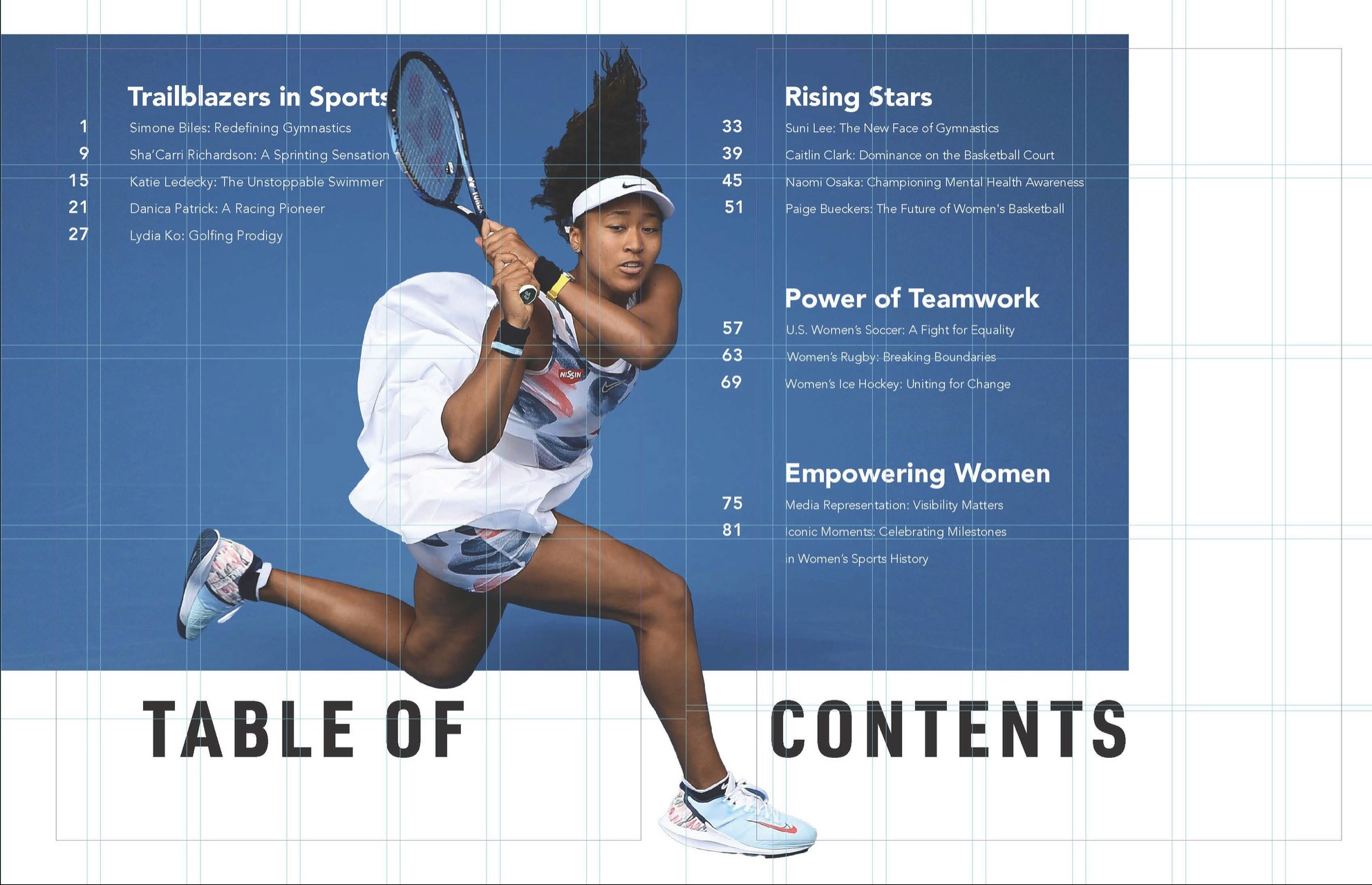
After finalizing the logomark, I moved on to designing the spreads for the publication. I began by experimenting with various grid systems until I decided on the correct one for my content. Next, I selected, legible, fitting typefaces for the body copy and ensured that the images and text worked cohesively. The process then involved refining and iterating until everything came together.
In Conclusion
After finalizing the logomark, I moved on to designing the spreads for the publication. I began by experimenting with various grid systems until I decided on the correct one for my content. Next, I selected, legible, fitting typefaces for the body copy and ensured that the images and text worked cohesively. The process then involved refining and iterating until everything came together.