Brand Identity Concept
This project focused on creating a new brand identity for RUIDOFEST, a Latin music festival. I designed a bold, adaptable logo system featuring vibrant colors and expressive type, then applied it across social media, posters, and large-scale advertising. The final identity captures the festival’s energy while staying versatile for both digital and print use.

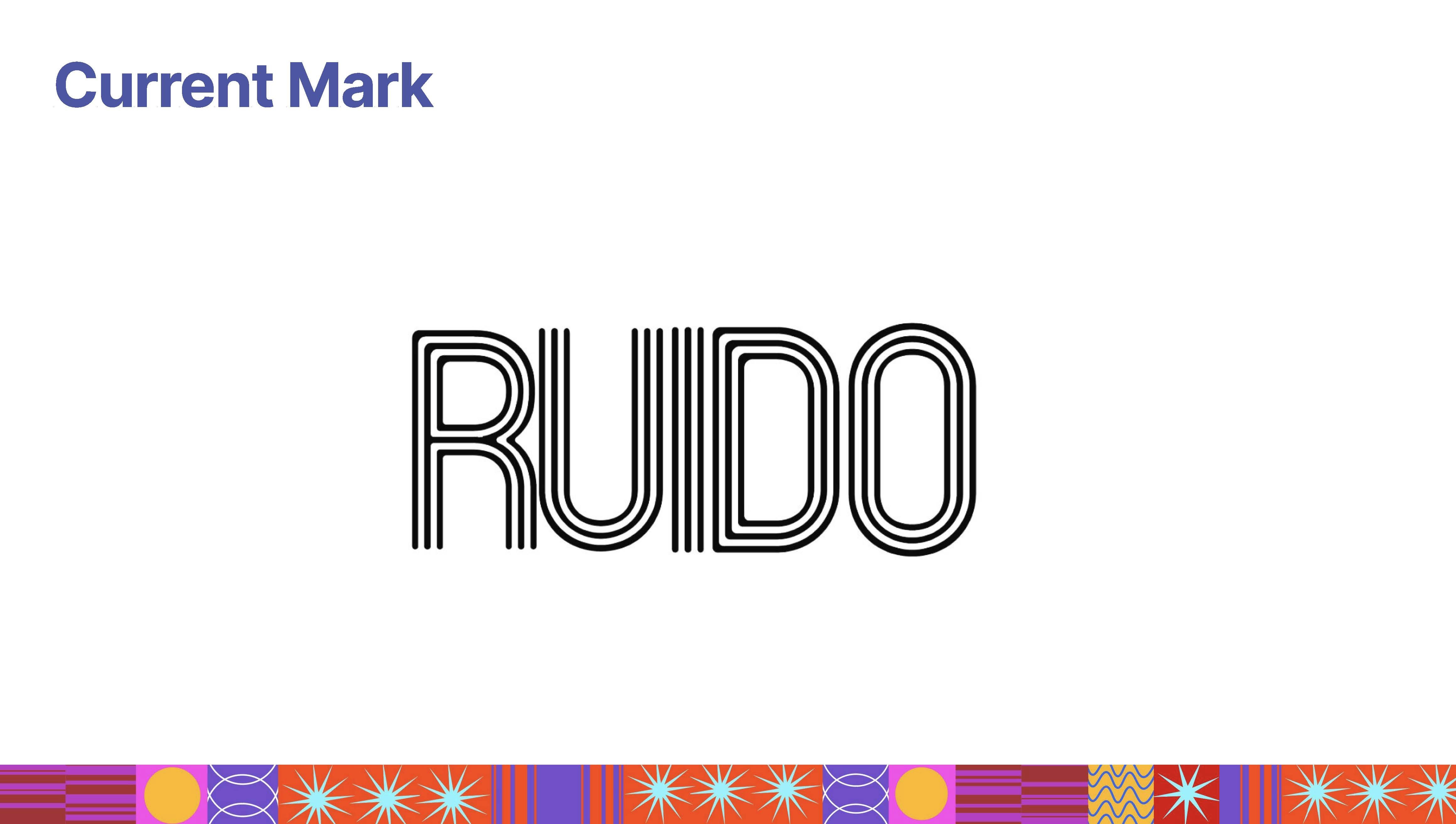
How it started
The existing branding lacked flexibility and didn’t reflect the vibrant, dynamic nature of the festival. I started by researching similar music events and looking at how their branding connected with audiences. From there, I explored different directions for logos, typography, and color, focusing on ways to make the identity more engaging and adaptable for different uses.
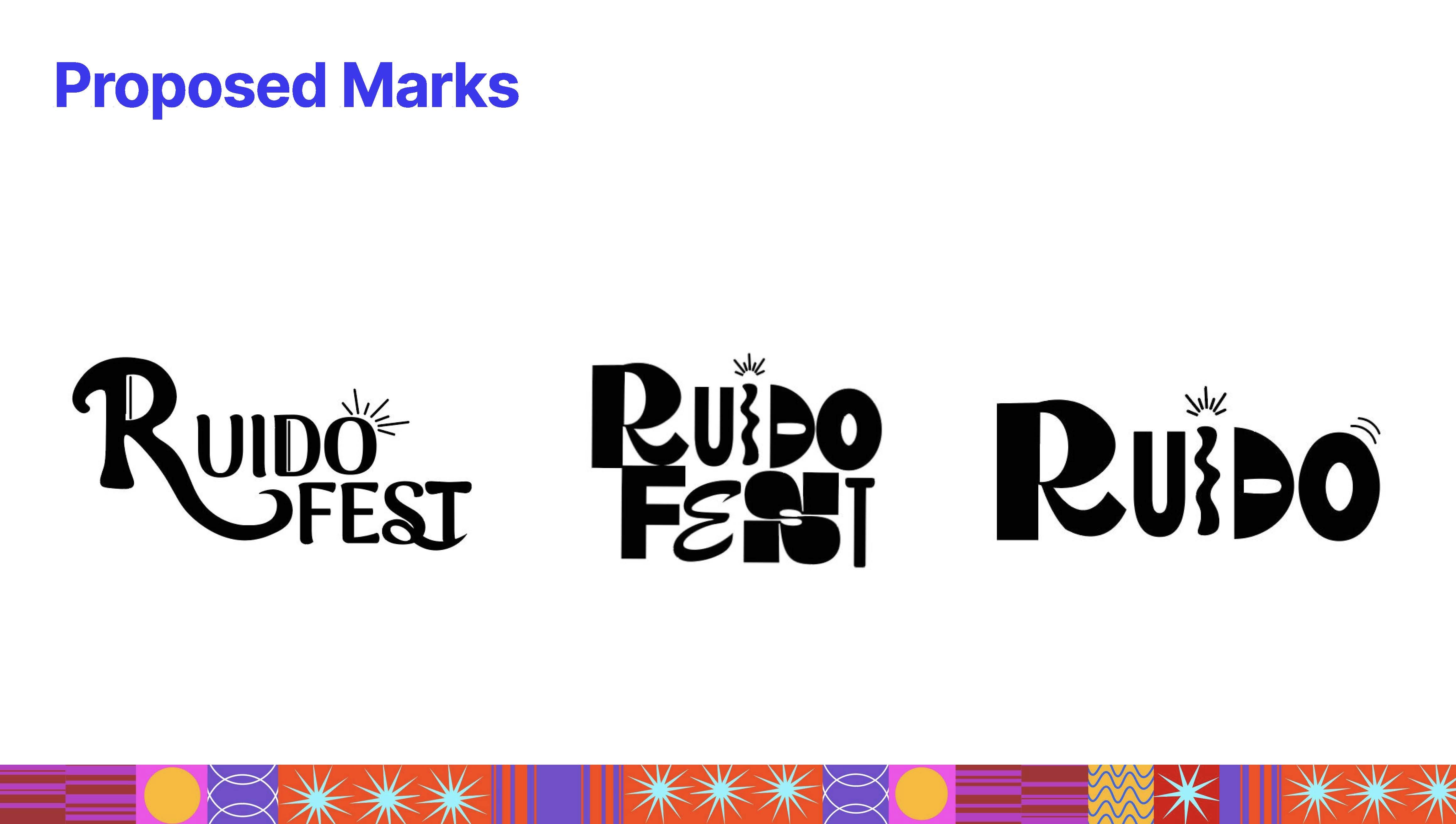
Process
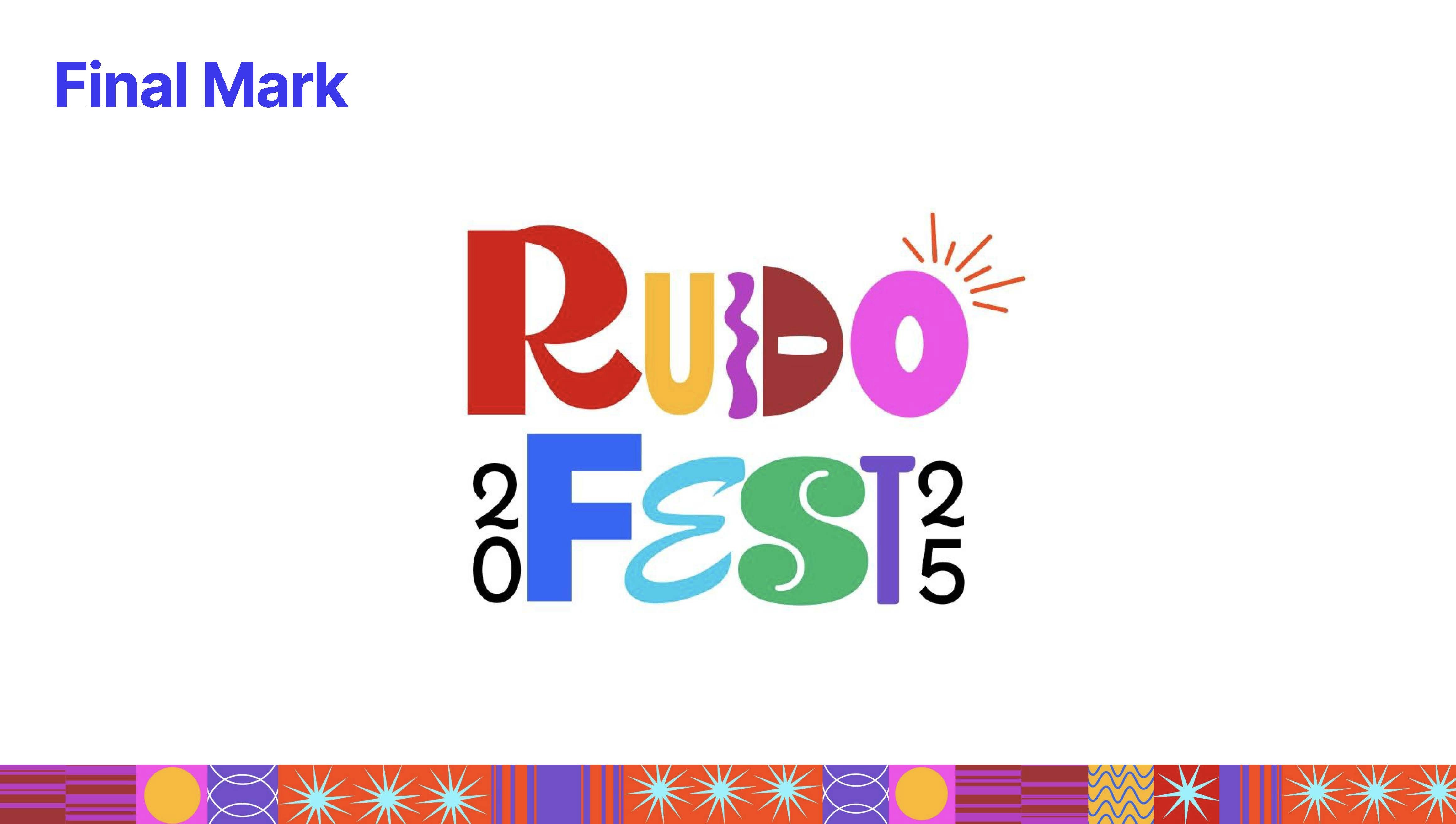
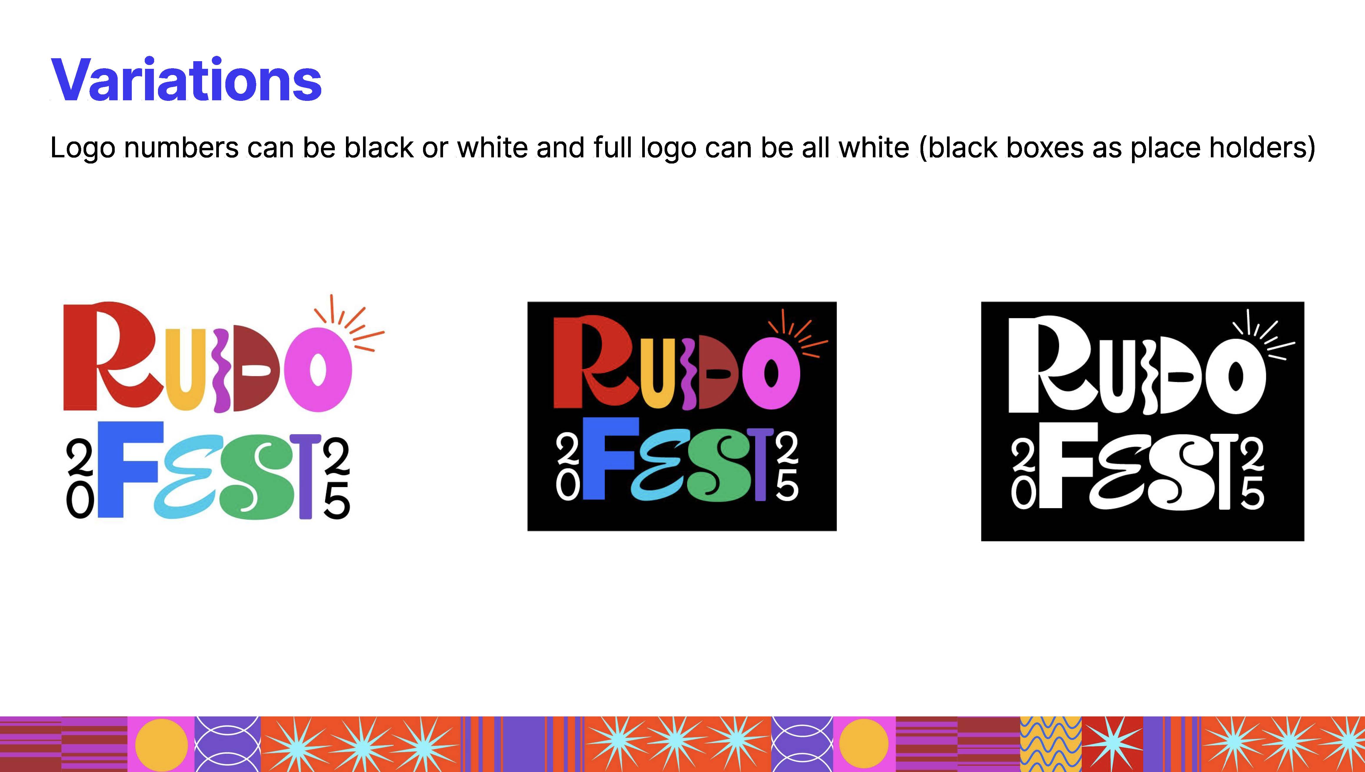
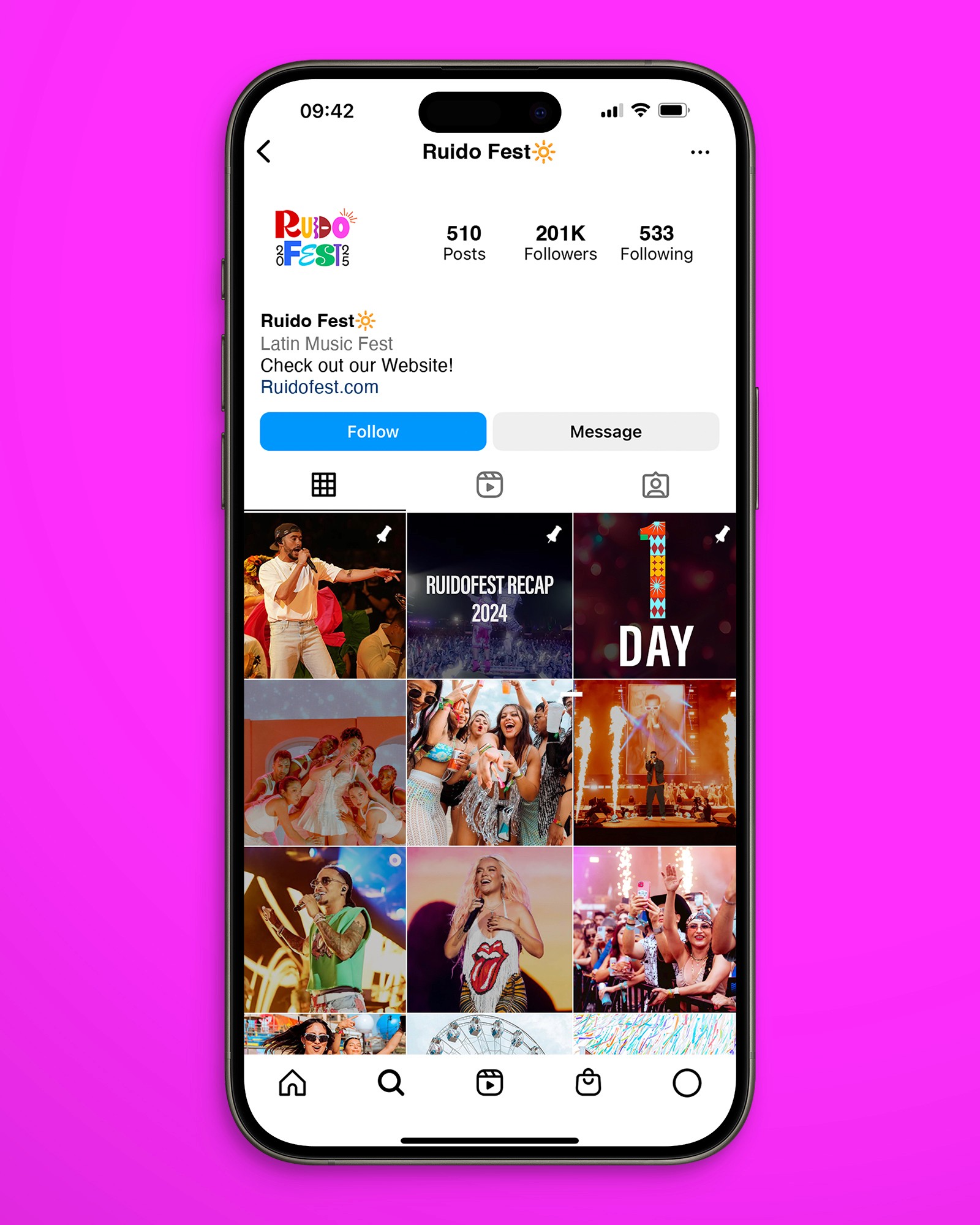
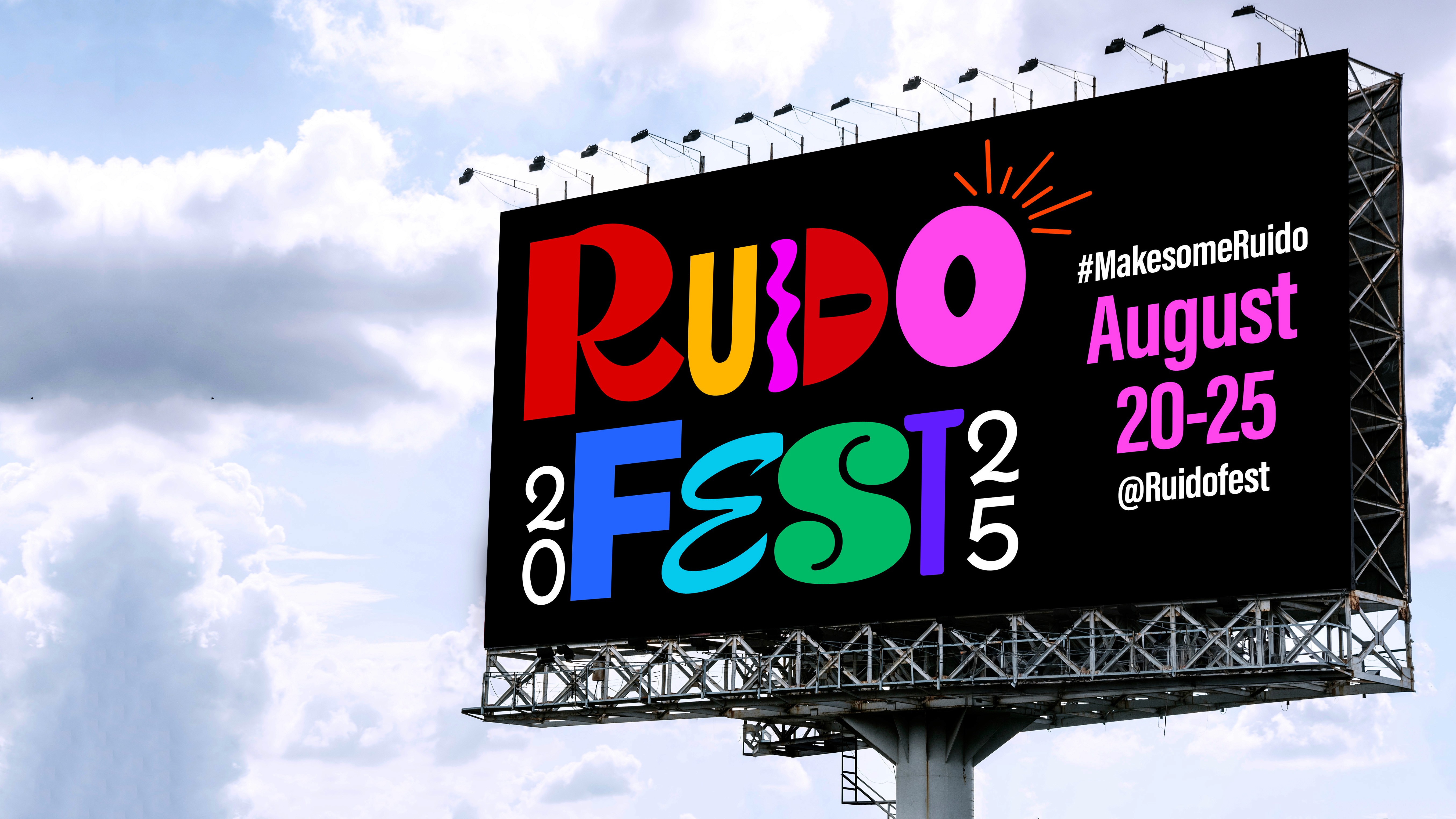
Through multiple iterations, I refined the logo into a flexible mark with variations that could shift across media while staying consistent. I decided the final mark shpuld incorporate a bold color palette and expressive typography to create a cohesive look. The identity was then applied to social media, posters, and large scale billboards to ensure it worked across digital and physical touchpoints.
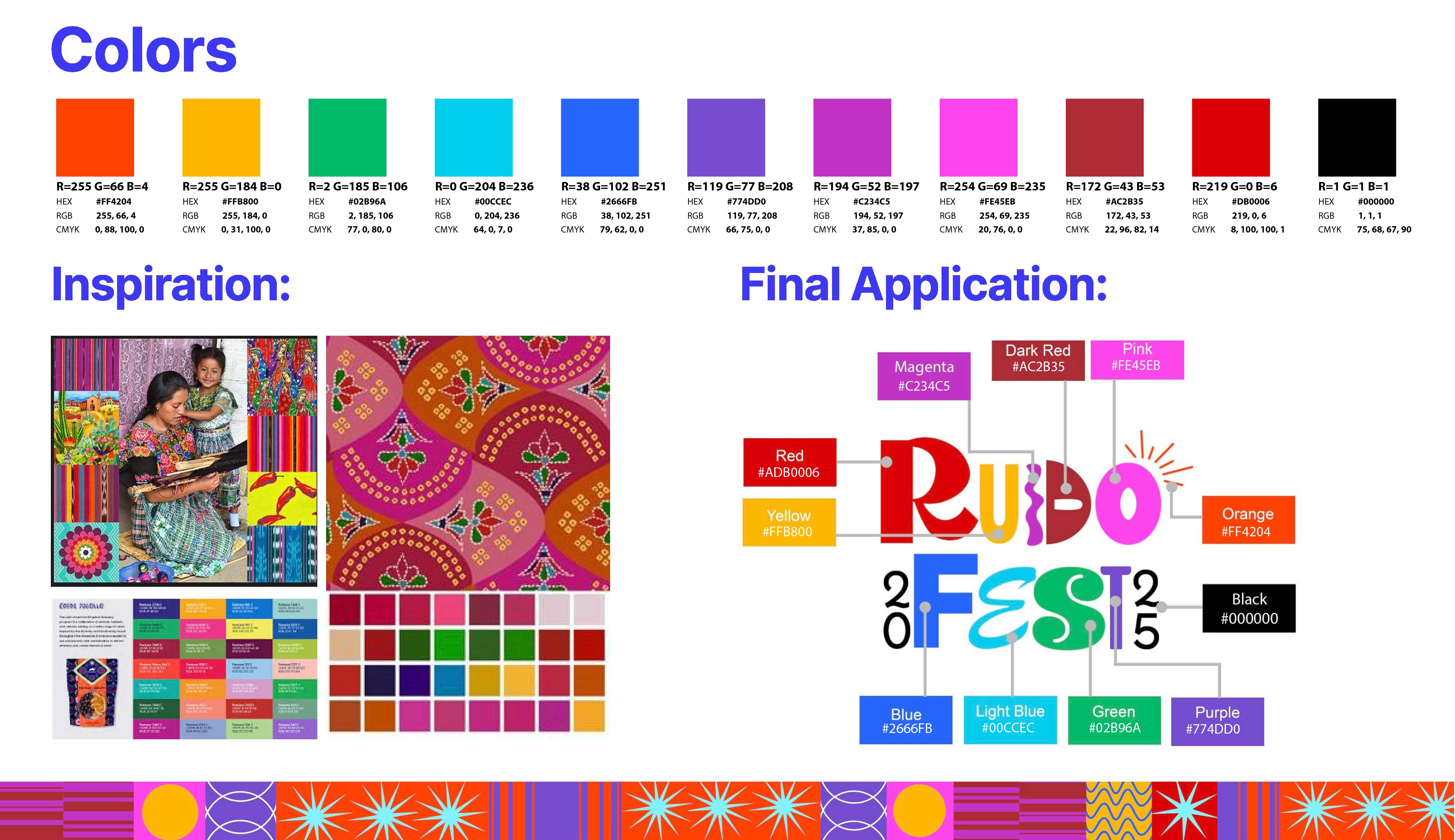
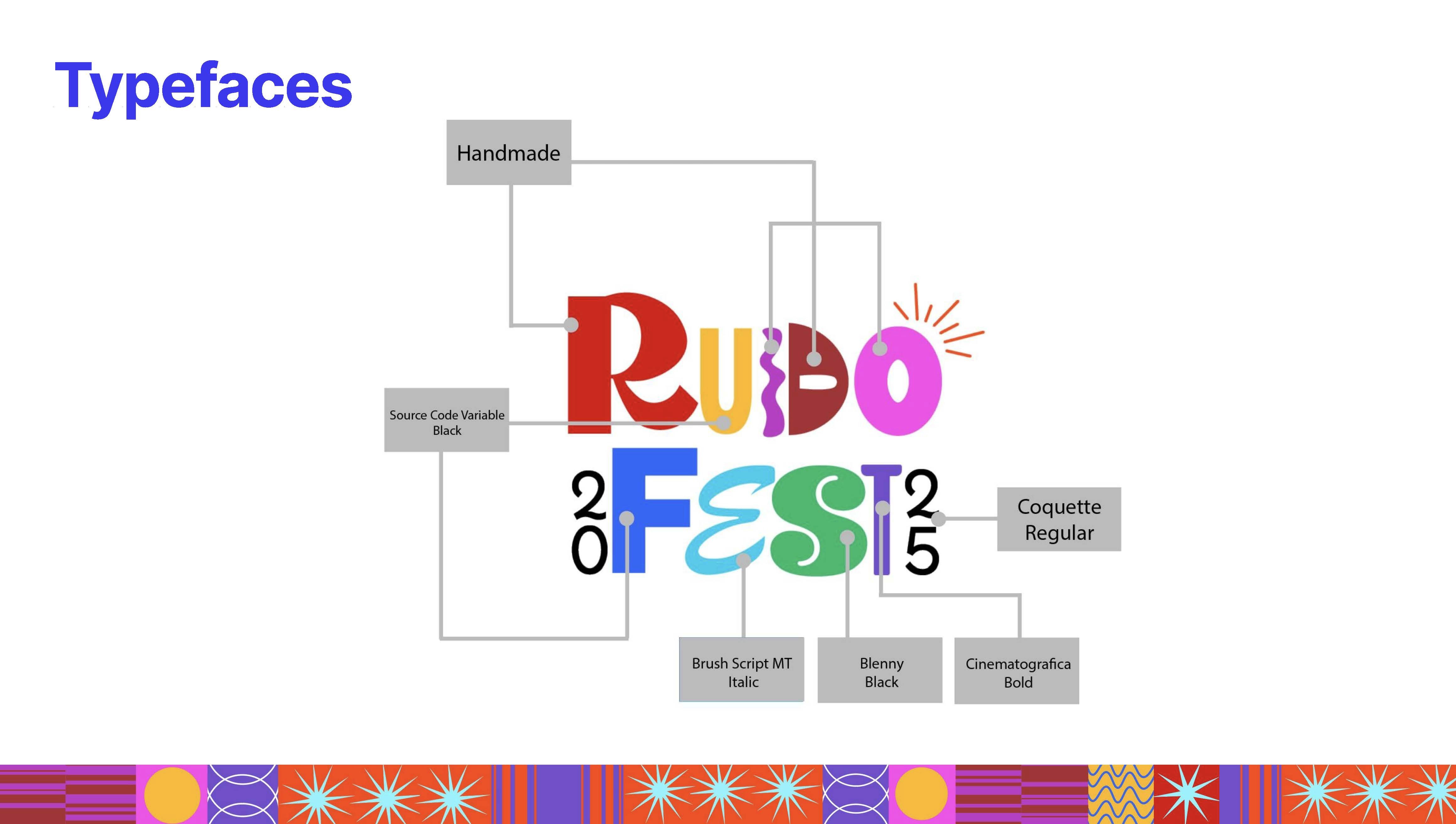
Final Applications
Bottom line
The final identity gave RUIDOFEST a refreshed look that feels more modern and vibrant. It communicates the spirit of the festival, while staying functional across platforms. The redesign not only elevated the festival’s presence but also showed the importance of creating a system that is consistent and adaptable.
