Craigslist Website Redesign
For this project, my team and I redesigned the Craigslist website. Our biggest focus was on accessibility, navigation, and usability, especially for older users and those who are less experienced internet users. We identified key issues such as poor hierarchy, small buttons, confusing navigation, and redundant filters. Our solution brought clarity, larger and more legible typography, simplified layouts, and intuitive navigation to create a more user-friendly experience.
How it started
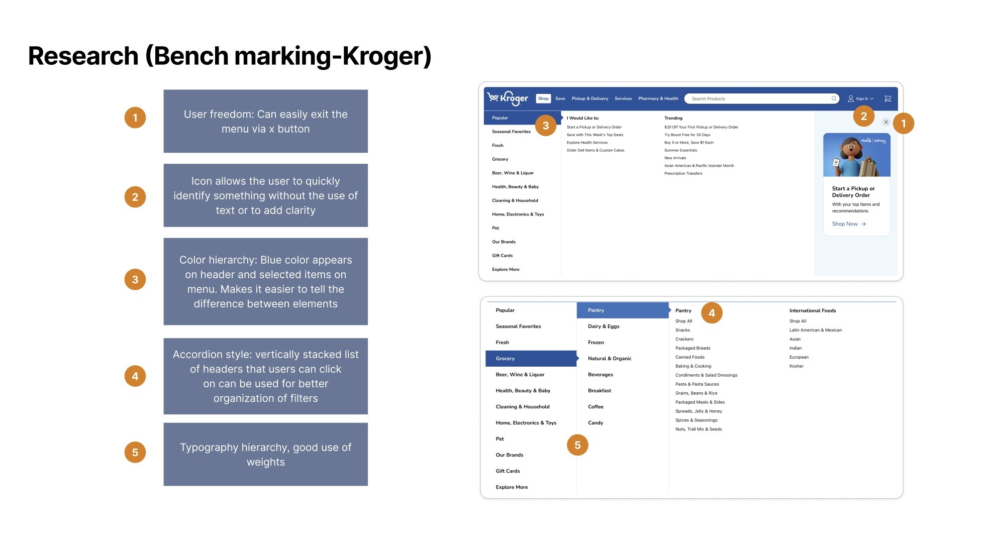
My group and I, started off the project by benchmarking similar platforms like Zillow, Instacart, and Kroger to understand effective use of hierarchy, navigation, and layout. From there, we developed personas representing older users and individuals with varying levels of digital literacy to have a foundation of our direction with this redesign. Using what we learned and applying it to user testing allowed us to move from early sketches and paper prototypes into digital wireframes. From there it was a lot of testing and refining the interface at each stage to ensure we were keeping the users needs in mind.


Process
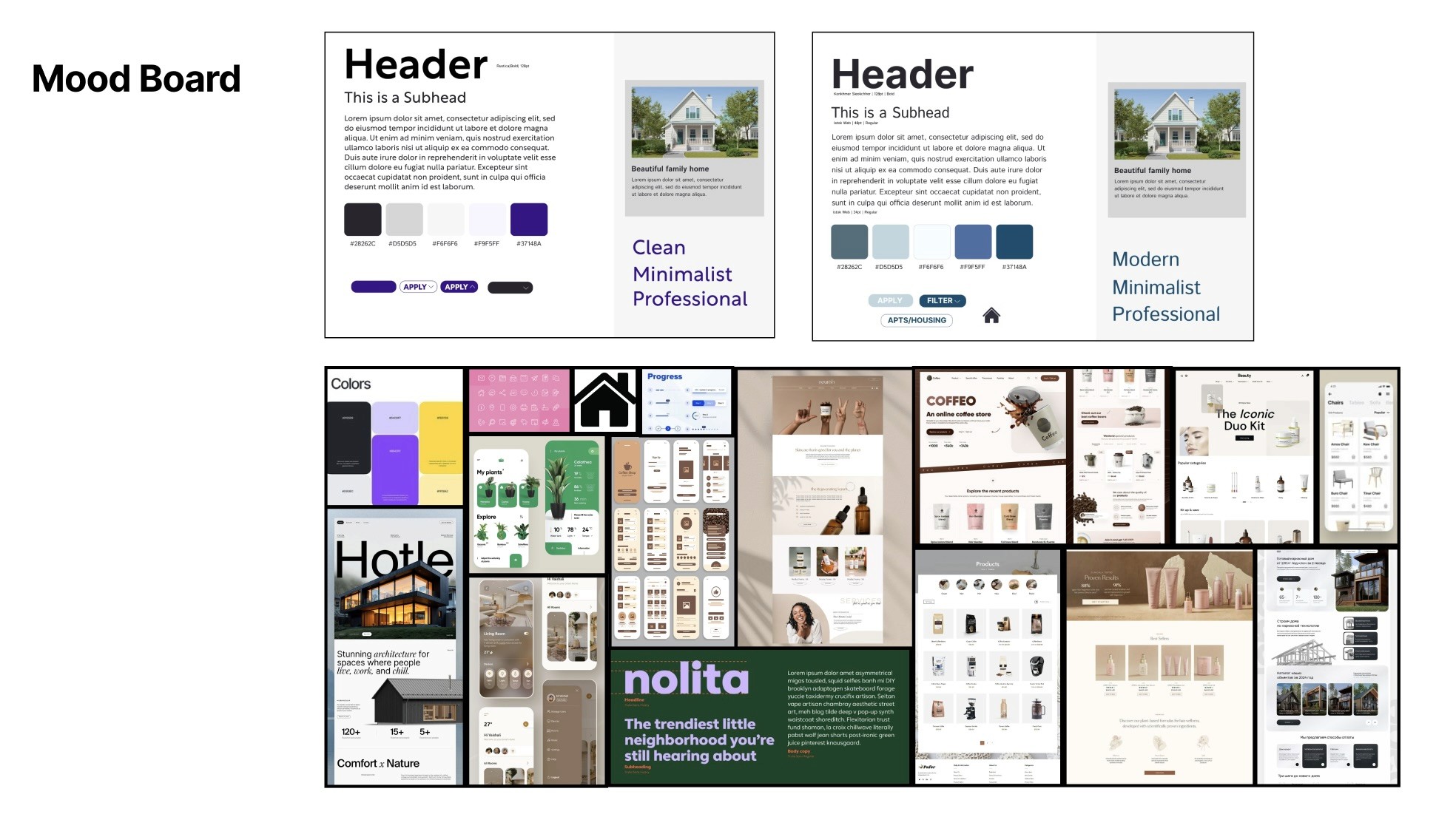
In our process, we brought ideas together through sketching and paper prototyping, as well as wireframing before moving into color exploration and overall aesthetics. From there, we began working on the full redesign, testing and refining based on user feedback and experiences. Throughout, we kept our personas in mind and made sure the redesign consistently reflected our core goals of accessibility and usability.


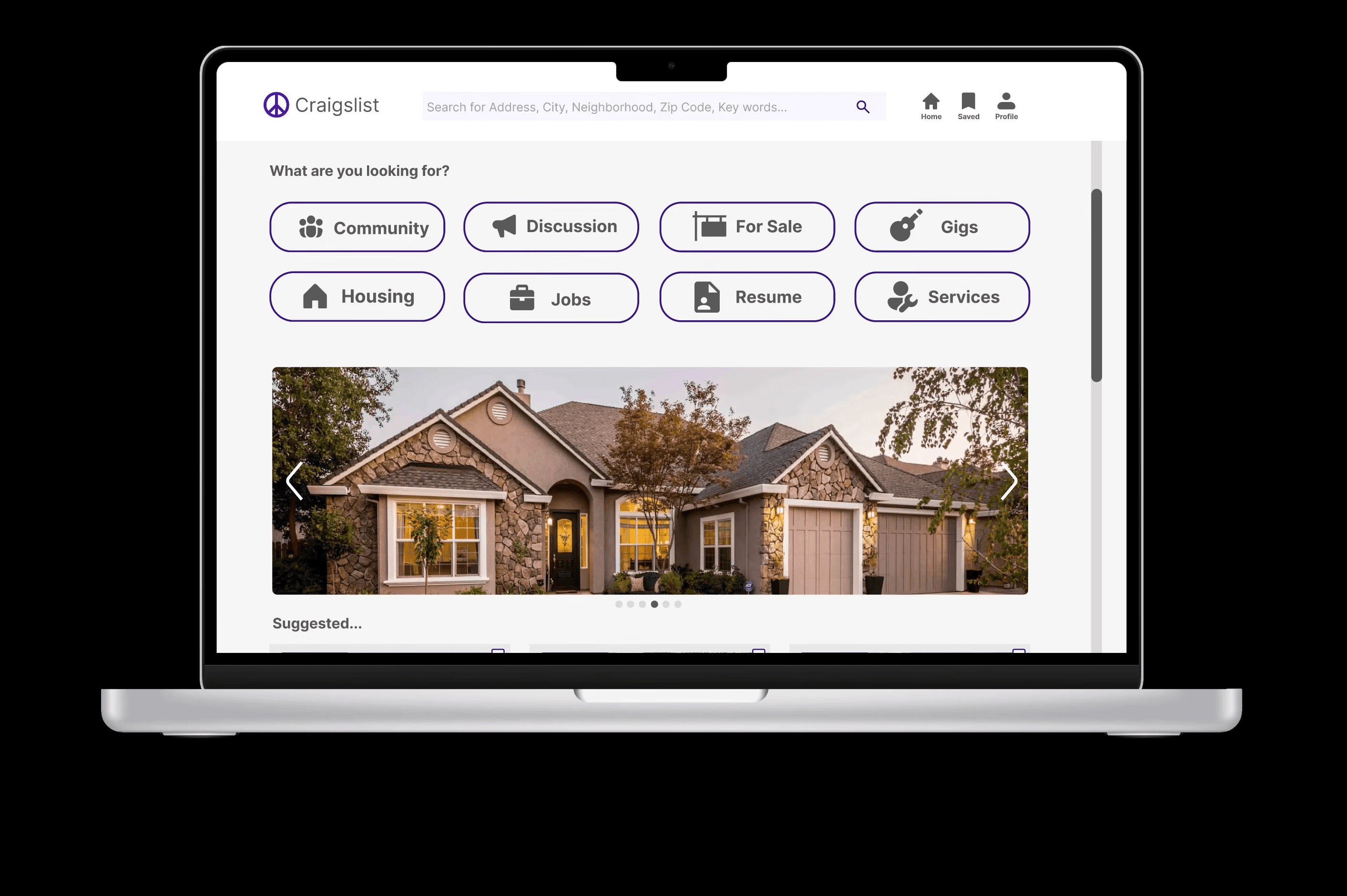
Final
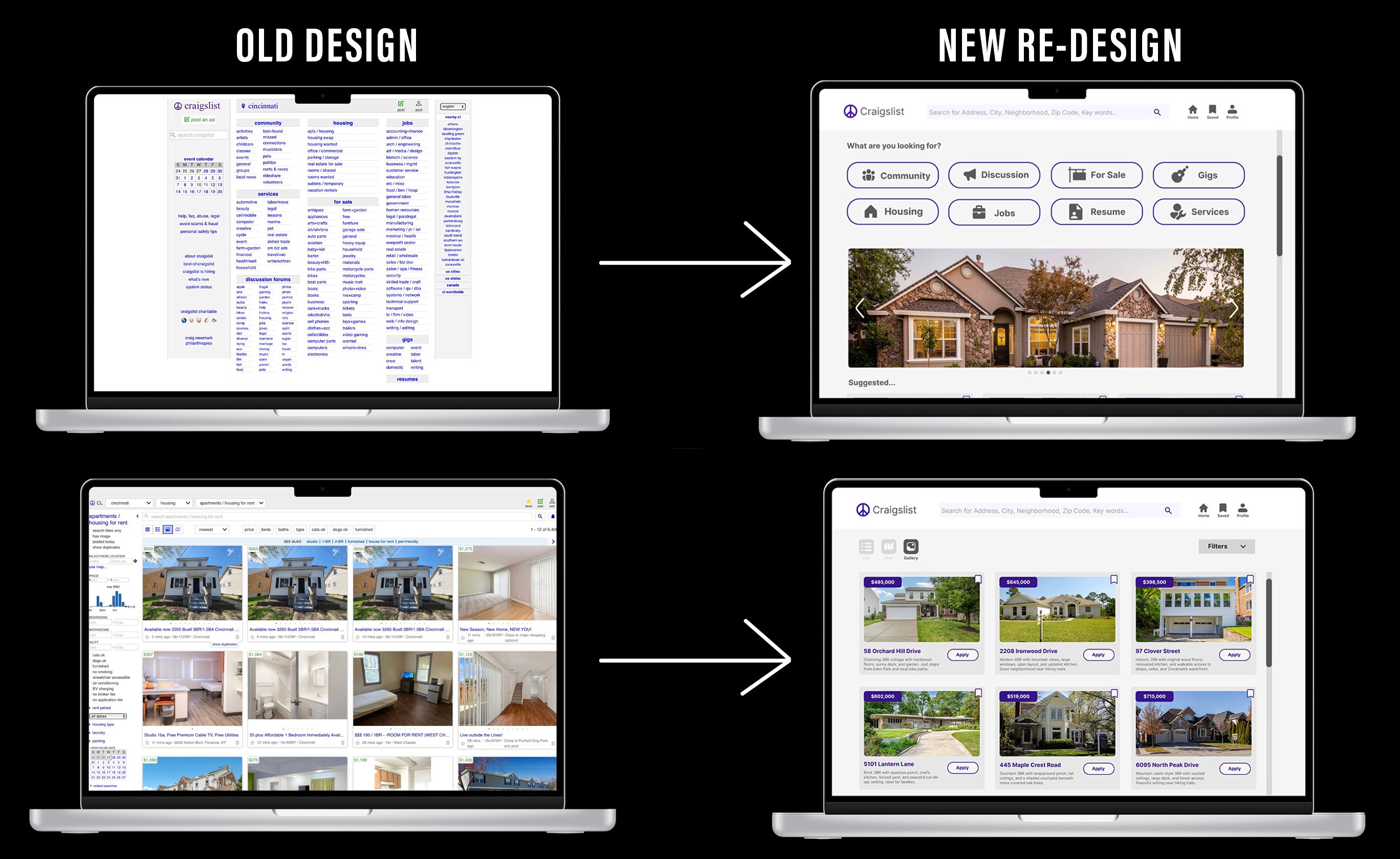
Final Prototype
Bottom Line
Completing this redesign project strengthened my understanding of user-centered design, but it also gave me hands-on experience moving from research and prototyping through to testing and refinement. I got to really dive into the UI/UX process an I’m excited to carry these skills forward into future projects and apply them across other areas of design.
